Monday, May 4, 2009
Interpretation of Poem
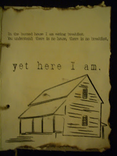
Project 3: Finished Poem Book
Monday, April 20, 2009
Project 2 - Finished!


My self-visualization focuses on two very distinct aspects of my personality. As a Biology major, I enjoy science, order, and structure. I tend to think in a logical frame of mind and like reasoning and analysis of problems. The right panel in my self-visualization represents this part of my personality. I attempted to incorporate technology related images into this panel (merging circuits with the matrix), all while keeping the composition very linear. I purposely used a profile image of my head to compliment the piece’s linearity, and edited it to make it seem very flat. The left panel in my self-visualization, on the other hand, represents the creative side of my personality. I am a fine arts minor, so I enjoy being expressive and imaginative. This image is a combination of hand painted artwork and imaging artwork: I painted the paint splats with watercolors and scanned it into the computer to merge with an edited self portrait. I tried to give this image a very loose and organic feel. Because these two aspects of my personality are so different, I also used color to contrast the two panels. The right panel, for example, is mostly a reddish-orange, while the left panel is blue-green.
Dia:Beacon
The Dia:Beacon trip was an interesting experience for me. To be quite honest, I’m not a fan of modern art, but I tried to enter the museum with an open mind. My first thought upon arriving at the museum was that the building was beautiful. The architecture was very interesting and I loved the big, open spaces. (I also thought, having grown up in the Hudson River Valley, that the area was gorgeous). However, I was less enthusiastic about some of the collections that were actually in the museum. Perhaps Robert Ryman’s disappointed me the most. As I said, I tried to be very open-minded about the exhibits in this museum, but I honestly could not find anything artistic about white canvases. Admittedly, he was making a bold statement by having the nerve to show something so plain, but I don’t think that warranted an exhibition in a museum. In fact, walking into his collection made me angry – how could something that takes no talent be displayed as though it was art? Perhaps I just don’t understand it, but I did not like his collection at all.
However, there were some exhibits that I did like. John Chamberlain’s “The Privet” was very visually interesting – I enjoyed the colors and the sheer scale of the piece. I liked the fact that it was crafted out of metal, but from far away seemed to have a less substantial texture. Fred Sandback’s string sculptures were also very interesting. I found it interesting how he was able to create 3D space from a one-dimensional object. Finally, Richard Serra’s Torqued Ellipse I, Torqued Ellipse II, and Double Torqued Ellipse were fascinating because they incorporated an interactive element – I liked how one could see both the inside and the outside of such a huge sculpture.
Monday, April 13, 2009
Poem for Project 3
Morning In The Burned House
In the burned house I am eating breakfast.
You understand: there is no house, there is no breakfast,
yet here I am.
The spoon which was melted scrapes against
the bowl which was melted also.
No one else is around.
Where have they gone to, brother and sister,
mother and father? Off along the shore,
perhaps. Their clothes are still on the hangers,
their dishes piled beside the sink,
which is beside the woodstove
with its grate and sooty kettle,
every detail clear,
tin cup and rippled mirror.
The day is bright and songless,
the lake is blue, the forest watchful.
In the east a bank of cloud
rises up silently like dark bread.
I can see the swirls in the oilcloth,
I can see the flaws in the glass,
those flares where the sun hits them.
I can't see my own arms and legs
or know if this is a trap or blessing,
finding myself back here, where everything
in this house has long been over,
kettle and mirror, spoon and bowl,
including my own body,
including the body I had then,
including the body I have now
as I sit at this morning table, alone and happy,
bare child's feet on the scorched floorboards
(I can almost see)
in my burning clothes, the thin green shorts
and grubby yellow T-shirt
holding my cindery, non-existent,
radiant flesh. Incandescent.
Margaret Atwood
I find this poem fascinating because it touches on such as sad topic and evokes such strong images. However, despite being so dark, the narrator describes death in a somewhat existential or even positive light (she uses terms like “radiant flesh” and “incandescent” to describe such a brutal death). I've thought long and hard about how I should approach this project, and I eventually decided that I will create a traditional book format. This poem is very visual, so I plan on illustrating some of the images that are described. I would like to illustrate by hand with India ink, and then scan that in to incorporate with the text. Once printed out, I would like to attempt to burn the edges of the paper. I especially like the idea such ordinary objects being touched by disaster in the poem, and I would like to illustrate that by literally burning some of what I create. I would like this book to appear as though it was a part of the burned house which is described in the poem.


